Appearance
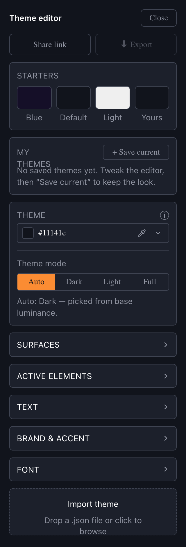
Theme Editor
Guide for Customizing Sportsbook Using Theme Editor
With the Theme Editor, you can customize the appearance of your Sportsbook to perfectly match your brand — its colors, typography, and the look of interactive elements. Every change is previewed live in the interface beside the editor, so you can fine-tune the result before you apply it. Once you are happy with your theme, you export it and apply it automatically during SDK initialization. Let's go over all the sections to help you make the desired changes easily.
INFO
NOTE: The Theme Editor opens as a panel on the desktop Sportsbook. You can save your themes locally, share them with a link, and export them for integration — all from the same panel.
1. Starters: preset themes and your personal preset
The Starters row lets you jump to a starting point with a single click:
- Blue: a deep-blue palette for a refined, modern look.
- Default: the standard Sportsbook theme. Clicking it also resets everything back to the stock design.
- Light: a light palette that gives the interface a bright and airy feel.
- Yours: your personal preset. It automatically captures your current custom theme, so you can preview another starter and snap straight back to your own work.
2. Theme Generator: build a full palette from one color
The Theme Generator creates a complete, balanced color scheme from a single base color. Pick one color — for example, your main background — and the generator derives the surfaces, accent, and text colors around it so that everything harmonizes automatically. You can then fine-tune any individual color in the Color Customization sections below.
Use the Theme mode switch to control how the base color is interpreted:
- Auto: detects a dark or light theme automatically from the brightness of the base color.
- Dark: builds a dark theme — the background sinks into a deep tone and surfaces lift toward white.
- Light: builds a light theme — the background lifts to a bright tone and surfaces sink toward black.
- Full: uses your picked color exactly as the background, with no adjustment. Very bright or highly saturated colors may look loud or reduce readability.
INFO
NOTE: In Auto mode, if the picked color falls outside the comfortably readable range, the Theme Editor softens the background and shows a short notice. Switch to Full if you want to keep the exact color.
3. Color Customization: detailed color adjustment
For full control, you can adjust each interface element individually. The controls are organized into collapsible groups.
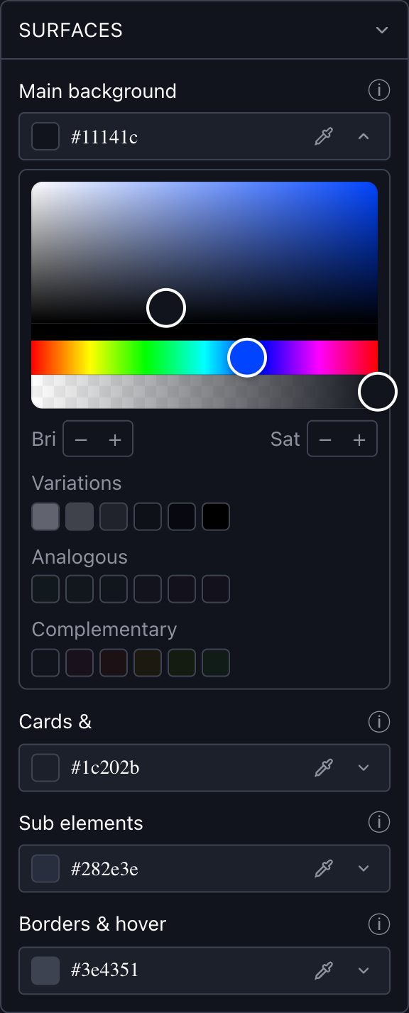
Surfaces — the background layers of the interface:
- Main background: the main background behind everything.
- Cards & popups: background of cards, popups, and dropdown menus.
- Sub elements: background of raised controls — inactive tabs, the search bar, date pickers, and filter chips.
- Borders & hover: borders and dividers throughout the UI, plus the hover and raised background on tabs and chips.
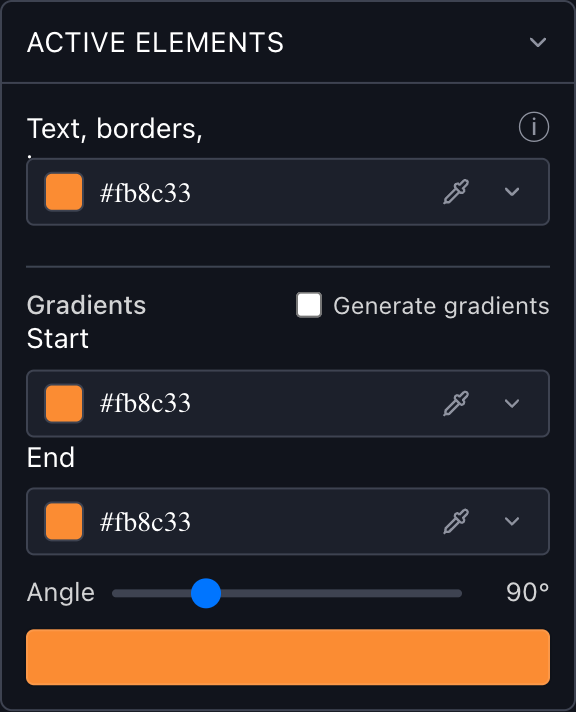
Active elements — your primary brand color:
- Text, borders, icons: the primary brand color used for selected tabs and filters, active items, link hovers, and icons.
- Gradients: optionally give active button fills a gradient instead of a solid color. Set a Start and End color and the Angle, or enable Generate gradients to derive a matching gradient from your brand color automatically.
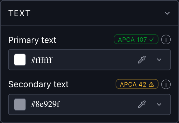
Text — the readability of copy:
- Primary text: headings, active tab labels, odds and amounts, and prominent button text.
- Secondary text: inactive tab labels, hints, captions, and muted metadata.
Each text control shows a small contrast badge that checks the text color against its background: it turns green when the contrast is comfortable to read and amber when it may be too low. This is a guideline to help you keep text legible — it does not block any color choice.
Brand & Accent — the semantic colors:
- Secondary accent: a secondary brand color that drives selected outcome odds, betslip items, bonus buttons, and the active menu item.
- Positive: the "good" color — rising-odds indicators, success messages, and positive badges.
- Negative: the "bad" color — falling-odds indicators, errors, and alerts.
- Warning: the "attention" color — locked or suspended markets, bonus highlights, and caution badges.
INFO
NOTE: Some bet-status chips (such as won / lost / cashout) use a separate fixed palette and are not affected by these colors.
Color picker tools — for every color above, the picker offers:
- A hex input for an exact value, plus an opacity slider for transparency.
- A screen eyedropper to sample any color on screen (available in Chromium-based browsers).
- Recent, Variations, Analogous, and Complementary swatches for quick choices.
- Bri and Sat steppers to fine-tune brightness and saturation.
- Undo to step back, and a Reset (↺) control to return a single color to its default.
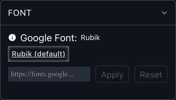
4. Fonts: apply a custom font
In the Font section, you can change the Sportsbook typeface using a Google Fonts link.
- Paste a Google Fonts URL — for example,
https://fonts.googleapis.com/css2?family=Ubuntu&display=swap— and click Apply to preview it live. - You can load several fonts to compare them, but only one can be active at a time. The active font is the one saved and exported with your theme.
- Click Reset to return to the default font.
INFO
NOTE: Only a Google Fonts link is accepted, and only one font family per link is supported. You can browse fonts at https://fonts.google.com/.
5. My Themes: save, reuse, and share
Beyond exporting, you can keep and share your work directly from the editor:
- My themes: click + Save current to store the current colors, theme mode, and font as a named theme. You can re-apply, rename, or delete a saved theme at any time. Saved themes are kept in your browser, so they are tied to the browser you saved them in.
- Share link: click Share link to copy a link that reproduces your current theme. Anyone who opens it sees the Sportsbook with your theme applied — useful for sharing a look with your team for review.
6. Saving and exporting settings
Once you finish customizing your theme, click ⬇ Export to download it as a zip archive (sportsbook-theme.zip). The archive contains three files:
- theme-editor-data.txt: a string you add to the
themeEditorDataparameter during SDK initialization to apply the theme automatically (see the Shadow mode and iFrame integration guides). - theme-admin-upload.json: re-import this file into the Theme Editor later for further adjustments. You can also send it to our team, and we will apply your settings to your Sportsbook.
- theme.css: a ready-to-use CSS file containing all your theme variables. To apply it to the Sportsbook, host the file and pass its public URL to the
customStylesparameter during SDK initialization — the same approach described in Other customizations.
INFO
NOTE: The variables take effect only when they are declared under the :root, :host selector — :root applies them in iFrame and light-DOM integrations, and :host applies them in Shadow mode. The exported theme.css is already wrapped this way; keep this structure if you edit it or write your own file:
css
:root, :host {
  --active: #fb8c33;
  /* …the rest of your theme variables… */
}To continue editing a theme you exported earlier, use the Import theme area at the bottom of the panel: drop a .json file (your theme-admin-upload.json) or click to browse. Your colors, gradient, and font are restored so you can pick up where you left off.
This functionality makes it easy to create, save, import, export, and share your theme settings, allowing you to quickly integrate your style into any platform.